Saturday, 24 March 2012
Design Studio: Exp1: Produced Video
This video combines the previous videos into one and is cut with slides showing the words that influenced and impacted the final design and its textures. The song used is "Daybreak" by Snow Patrol and I do not own this song.
Developed Model (FINAL)
I am quite happy with my final design. It is aesthetically pleasing and all the levels seem to work together cohesively as a unit.


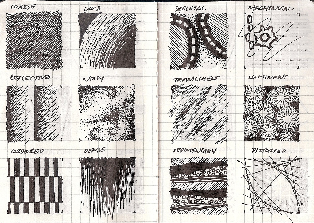
The stairs to the Above Ground level reflects the "repeating" of Ai Weiwei, and also complements the overall structure of the Above Ground form. The material chosen for the stairs is one of my custom textures that lends to the idea of repetition and "permanence" (another word that I chose to describe Ai Weiwei's work)


The stairs going from Ground to the Under Ground Studio for Louise Bourgeois is very simple. Cantilever beams extrude from the oddly shaped wall to create bent and unique stairs. These features create the space that represents the artwork I chose from Louise Bourgeois which I described as "destitute" and "suspended". The material used for the form of the Underground Studio is another custom texture that represents "fabric", looking at the material of the artwork.


This section shows the large interior spaces available to the artists and how the landscape comes into the design. The beams going across create an interesting design when the model is viewed from aerially. I have added stairs that come from the "ground" and into the gallery space which is floating over the landscape. It is textured with a custom texture which I feel relates to the nature and the landscape "organic". I also chose it because of the curved and natural form of the stairs and beams.


Draft Model 2

This was done after the week 3 lesson and the Google Sketchup tutorial in class. It was developed during week 4 however I felt that there was too much going on with the top half of the design, and I had trouble combining the two forms together.

Draft Model 1
This was done before the week 3 lesson. As you can see, my limited understanding of Google Sketchup has resulted in a mediocre design for the ground and above ground levels.


Tuesday, 13 March 2012


Week 3 Google Sketchup


At this point, i have only done the shell of the structures which will make up the two studios and the gallery space. Next I will move on to the stairs and the land surrounding the design.
Saturday, 3 March 2012
WEEK1: Best 4 Concept Sketches
Out of the 18 sketches that we had to draw for the first assignment, these were by far my favorites:
 1. (L.B. desolate; A.W. repeating) The patterns that I created in this concept sketch is very interesting and the dark colours makes for a bold drawing. That being said, the intricate design would be difficult to produce on Google Sketchup.
 2. (L.B. human; A.W. repeating) The above ground idea came from the form of cells and the fluidity of the above design complements the diagonal pillars below. I need to figure out how to suspend the forms in mid-air.
 3. (A.W. repeating; L.B. suspended) Horizontal lines are prevalent in the above ground design and the thin supports below ground lends to the "suspended" idea of the below ground design. The three sections are clear, where the two ideas converge.
 4. (A.W. repeating; L.B. human) The diagonal pillars in the above ground design form the walls of artist 2's studio. The diagonal line is continued into the below ground studio with the shape of the G shaped structure.
Subscribe to:
Posts (Atom)